As you probably know Italy is experiencing one of the worst periods of its recent history. The covid-19 epidemic has put the medical system on its knees and the lock down is severely testing the population’s self-control capabilities.
Open data for the covid-19 infection is available here https://github.com/pcm-dpc/COVID-19 and updated daily. These are numbers and as usual they need to be read, understodd. One of the questions I was asking my self is how the rate of positives compared to the number of tests done is moving. I made this chart :
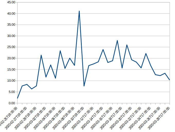
The ordinate is the percentage of positive cases against the number of tests done each day. Spikes of 42% are probably due to differences of response times for the laboratories which currently do not guarantee a stable processing time for tests. This behavior could be that due to the test methodology being changed or simply because we are finding less people infected.
Another information that can be interesting is the number of daily people being treated with intensive care :
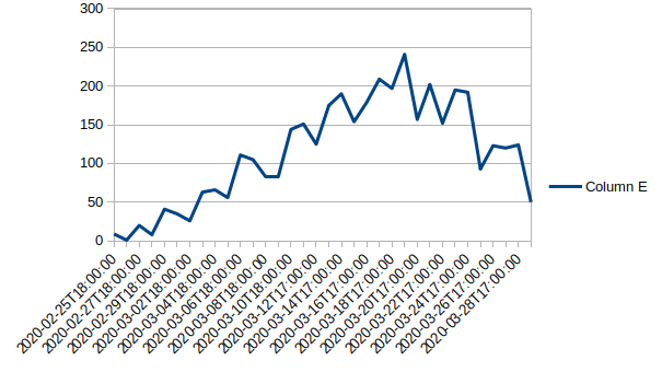
Again here we might be in a situation of saturation of Intensive care units or just the number of people being treated in intensive care is decreasing.
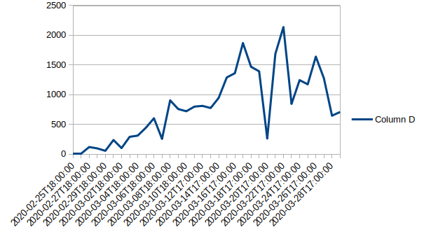
This is the behavior of the number of people being hospitalized